Designing operational dashboards that teams actually use
Most teams already have data — what they lack is the ability to connect it into fast, confident decisions. How we designed a dashboard structure built for operational clarity rather than reporting.
2 weeks
Prototype delivered
Interactive prototype for rapid stakeholder alignment
5
Analytical views
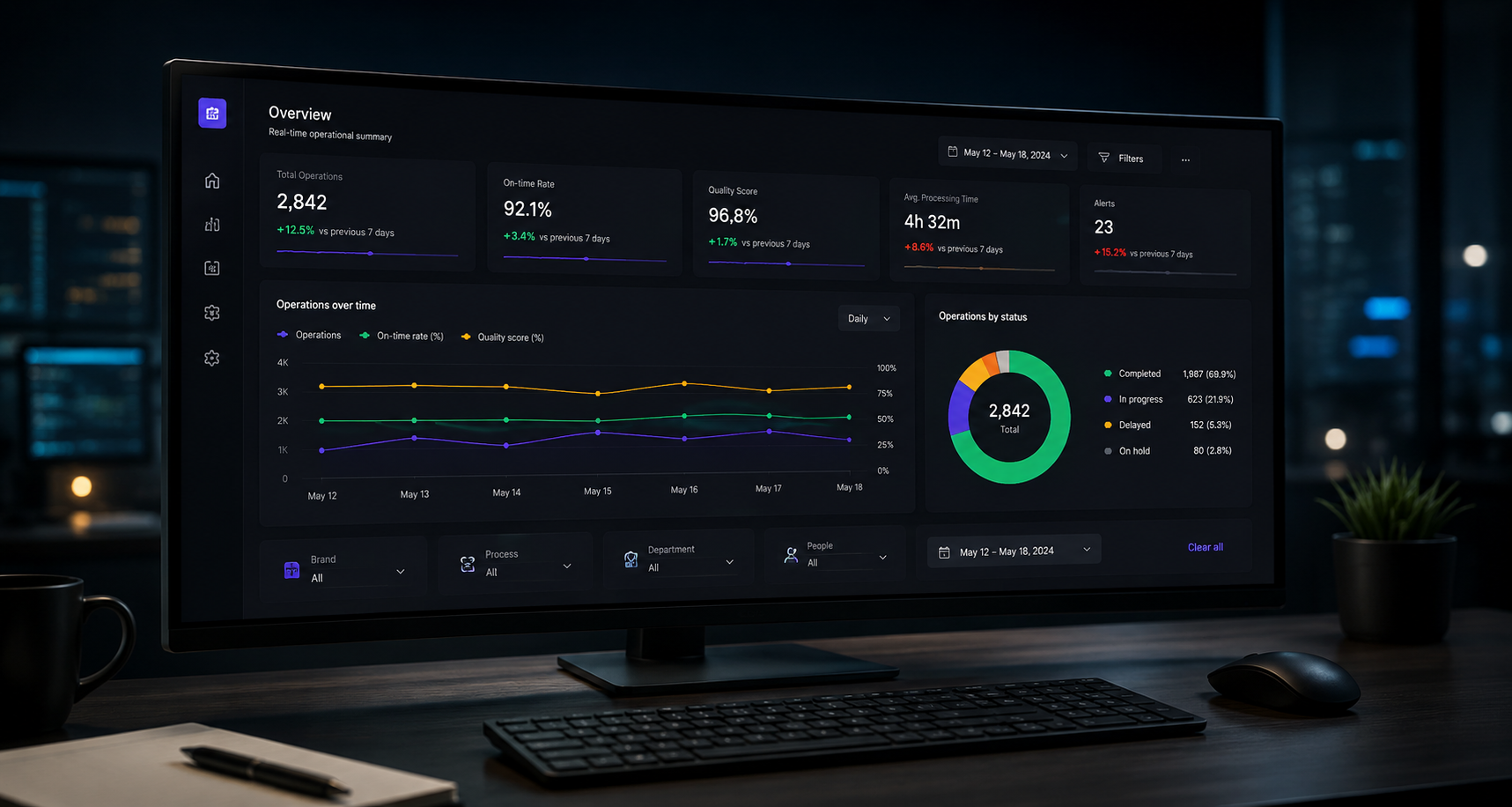
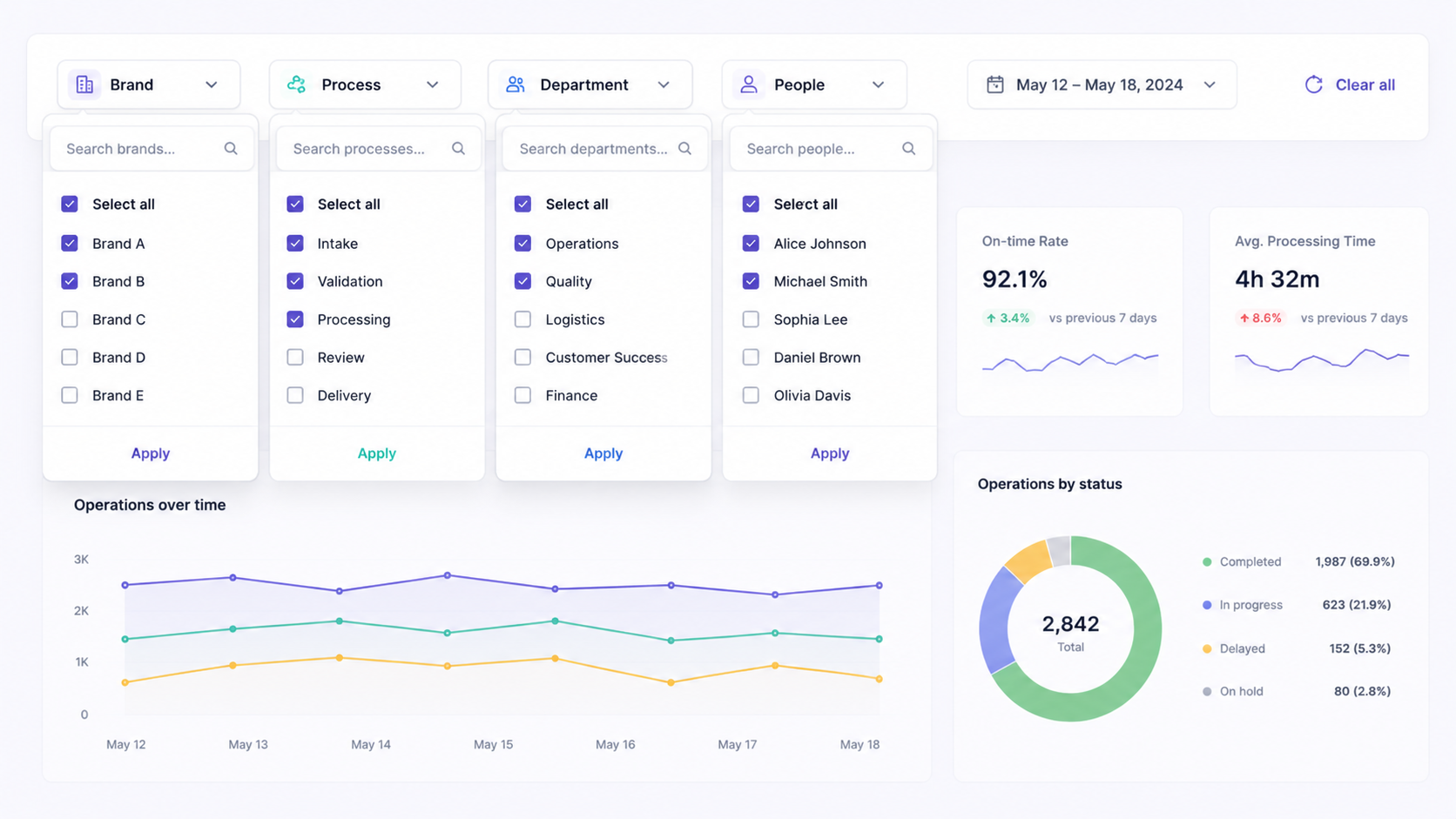
Executive, operational, resource and detail layers
10+
Analysis dimensions
Dynamic filters and cross-analysis capabilities
Spec-driven
Methodology
Functional specs, KPIs and data structures before code
Operational dashboards are often treated as reporting tools.
In practice, the real challenge is usually elsewhere.
Most teams already have access to data. They have KPIs, exports, spreadsheets, operational tools, and dashboards. What they often lack is the ability to connect information together in a way that supports fast and confident decision-making.
This project started from that observation.
The objective was not to create “another analytics interface”, but to design a dashboard structure capable of helping operational teams understand what was happening across multiple workflows, identify friction points, and navigate complexity without becoming overwhelmed by data.
Project highlights
2 weeks
Interactive prototype designed for rapid stakeholder alignment.
5 analytical views
Executive, operational, resource and detailed exploration layers.
10+ analysis dimensions
Dynamic filters and cross-analysis capabilities.
Spec-driven approach
Functional specifications, KPIs and data structures defined before implementation.
From fragmented data to operational visibility
One of the first observations during the discovery phase was that the issue was not data availability.
Operational information already existed across multiple systems and processes. But visibility remained fragmented. Teams had difficulty moving from isolated metrics to a coherent operational understanding.
Simple questions often required manual interpretation:
- Where are delays actually happening?
- Which workflows are degrading operational performance?
- Are certain teams, products or processes behaving differently?
- Which indicators deserve immediate attention?
The more dimensions involved, the harder the analysis became.
The dashboard prototype was therefore designed around a core idea: enabling cross-analysis without increasing cognitive complexity.
Instead of multiplying static reporting pages, the interface focused on dynamic exploration through filters, analytical views and contextual KPIs.
Designing for real operational usage
A recurring issue in analytics projects is that dashboards are often designed around data structures rather than operational behaviors.
In this project, the approach was intentionally reversed.
The prototype was structured around how teams actually navigate operational problems:
- starting from a global overview,
- isolating anomalies,
- narrowing analysis progressively,
- and moving between dimensions to understand root causes.
This had a direct impact on the interface design.
Several decisions became critical very early:
- reducing visual noise,
- simplifying navigation,
- prioritizing readability,
- and making filters feel natural rather than technical.
The goal was not to create an impressive interface during demos.
It was to create a tool people could realistically use every day.
Why the prototype phase mattered
The prototype itself became an important alignment tool.
Rather than discussing abstract ideas, stakeholders could interact with workflows, analytical structures and navigation patterns very early in the process. This helped clarify expectations quickly and identify friction points before implementation discussions started.
It also made product conversations significantly more concrete.
Questions moved from:
““What should the dashboard contain?””
to:
““How will teams actually use this information operationally?””
That shift changed the quality of the discussions entirely.
Building analytical flexibility without overwhelming users
One of the main challenges was balancing analytical depth with simplicity.
Operational teams need flexibility:
- filtering data,
- comparing dimensions,
- isolating patterns,
- navigating different levels of detail.
But too much flexibility quickly creates complexity.
The interface was therefore designed to progressively reveal information rather than expose everything at once. Filters, KPIs and analysis views were structured to support exploration while maintaining a clear visual hierarchy.
A large part of the work was ultimately less about “dashboard design” and more about organizing operational thinking visually.
Beyond reporting
Projects like this reinforce an important idea:
“A good operational dashboard is not primarily a reporting tool. It is a decision-support tool.”
The value does not come from displaying more data.
It comes from helping teams interpret situations faster, identify priorities earlier, and reduce operational uncertainty.
At Capamoon, this is how we generally approach operational products and internal tools: through a combination of product thinking, UX structure, operational understanding and iterative prototyping.
Because in complex operational environments, clarity is often more valuable than feature density.